Localization
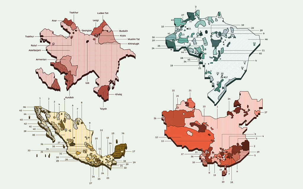
When we started thinking about the design of Imminent, the first idea that came to mind was this: let’s make maps of all the countries with the languages they speak. Great.
Our team collected data on languages, territories and populations; our designers started looking for a style to make the maps, and they decided on the colours.
The team was made up of two Italian designers, a Chinese colleague, an American born in Mexico, and me: I was born and raised in Italy, but my work has always been international.
We all agreed together on the colours and the style, based on our experience and our taste.
We designed hundreds of maps with thousands of languages. Divided up by continent and then by country.
A painstaking but wonderful job.
At a certain point, though, we started asking ourselves questions: are there five or six continents? We Europeans said five, since that’s what we learned at school. Our American colleague said six, as did our Chinese designer.
Okay, but if there are two Americas, where’s Central America? Can we tell a Mexican that we consider him a South American? Or a North American? Wait, don’t they want to put up a wall with Mexico in America? And what about Azerbaijan – is it in Asia or Europe? And Russia? Isn’t it half in Asia? And if there are two Americas, do we need to differentiate their colours? Could the colour we’ve chosen for Asia cause cultural problems?
Isn’t green forbidden in Indonesia? And isn’t yellow the colour of pornography in China?
In short, having already completed the vast majority of our work, we found ourselves in complete chaos.
We started asking our network of linguists for feedback. Now the process was starting to make more sense, but instead of getting easier, our life got even more complicated.
Because in addition to cultural sensitivity, we found ourselves faced with new sensitivities relating to identity, politics and gender, where a colour, map or icon can signify something or its opposite, with the ability to offend, to have different meanings, or even to mean nothing.
While visual messages were once confined to the cities and places where they originated, in contemporary society they come together in a melting pot. On the one hand, this helps people to connect and understand one another. But, something that works and makes people laugh in one culture can offend people and generate conflict elsewhere. Potentially devastating conflict.
Working in Europe and only considering our own culture entails bias in the way we communicate and generate creativity.
We now find ourselves in a time of equal opportunities, including when it comes to the focus on sensitivity around ethnicity and gender.
Communicating visually is very complicated – at times almost impossible.
But as designers, it’s our calling to summarise things.
To tackle this complexity, we need a method.
We need a way to compare points of view that is both functional and culturally sensitive.
And it’s urgent, because if we look at the disruptive capability of the web to bring together half of the world’s population in a global conversation within its first thirty years of existence, what will happen in the coming years, when new metaworlds and migrations caused by our inhospitable planet will generate new languages, new revolutions and new technologies?
The method we need to create and instil in the working practices of visual design inevitably involve dialogue with representatives of the various cultures involved and the establishment of a new process to ensure the multiculturality of visual design. At Imminent, we are in the fortunate position of being able to count on hundreds of multilingual cultural operators who spend their days transposing meanings from one culture to another. This is something we can build on to address crucial questions.
Let’s start with the questions we should have asked ourselves at the beginning of our project.
What is the state of the world?
Or, to put it another way, how can we express it spatially in an unbiased way, and how does the political situation change its boundaries?
In The Politics of Design: A (Not So) Global Manual for Visual Communication, Ruben Pater explores the political and cultural context of typography, colours, photography, symbols and all the infographics we use today.
In doing so, he claims that political and cultural awareness of our work does not limit our creativity, but rather opens up new pathways for creative exploration. And (going back to our maps) he tells the story of how, in November 2014, the Russian invasion of Crimea turned Google Maps into a battleground.
Initially, Google marked Crimea as a disputed area, representing it with a dotted border.
Under pressure from the Russian government, Google was forced to depict it as Russian territory.
Outside of Russia, it still has a dotted border.
The notion that maps are an objective and scientific rendering of the world is a common myth.
In 1931, in New Orleans, the mathematician Alfred Korzybski presented a paper on mathematical semantics in which he popularised the idea that the map is not the territory.
In Korzybski’s words:
A.) A map may have a structure similar or dissimilar to the structure of the territory.
B.) Two similar structures have similar ‘logical’ characteristics. Thus, if in a correct map, Dresden is given as between Paris and Warsaw, a similar relation is found in the actual territory.
C.) A map is not the actual territory.
D.) An ideal map would contain the map of the map, the map of the map of the map, etc., endlessly…We may call this characteristic self-reflexiveness.
Even the best maps have limitations, and Korzybski highlights a few:
(A.) The map could be incorrect without us realizing it;
(B.) The map is, by necessity, a reduction of the actual thing, a process in which you lose certain important information;
(C.) A map needs interpretation, a process that can cause major errors.
The Map is Not the Territory, Farnam street blog
The details of a map, such as the colour, are fundamental; including (or omitting) the names of cities could mean that a particular area is of interest (or not).
Modern cartography has its origins in colonialist Europe. And any map that indicates north is, in fact, already the product of cultural biases. A map should have no geographic centre. This is why, in 1943, the designer Buckminster Fuller devised a map of the world with no north, south, right or left: the Dymaxion Map. The map is divided into 20 triangles, allowing it to be re-folded into an almost spherical icosahedron.
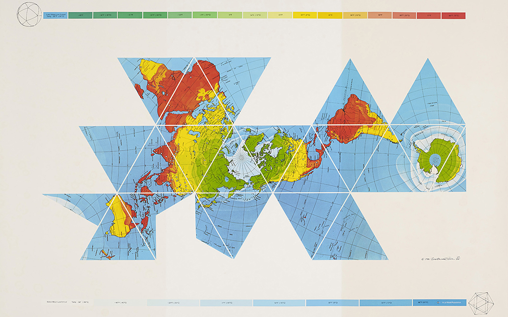
In 1943, the designer Buckminster Fuller devised a map of the world with no north, no south, right or left: the Dymaxion Map. The map is divided into 20 triangles, allowing it to be re-folded into an almost spherical icosahedron.
As sapiens.org (Nicola Jones, “Do you see what I see?”, Sapiens.org 2017) writes, the Candoshi, a tribe that lives in the heart of Peru, have no word for the concept of colour. However, they do have terms for black (kantsirpi), white (borshi), red (chobiapi), and yellow-orange (ptsiyaro). Things get trickier at the other end of the spectrum, towards blue: the word kavabana is used from green to purple, but kamachpa describes dark green.
“Of course some societies don’t have a word for color,” Kay adds. “There are tons of languages that have words for big and small, or hot and cold, without a word for size or temperature. Most unwritten languages don’t have words for abstractions. You don’t need ’em.”
The linguist Anna Wierzbicka of the Australian National University, Canberra, says: “Color is not a universal concern. All people use verbal resources to describe what they see. We categorize and compare but in different ways. One might group things by shininess, texture, or size; by something we have never thought of; or by all of these at once. Color is most important in a manufacturing society, where two objects might be identical except for color (a red shirt and a blue shirt). That just doesn’t happen in the natural world.”
We can therefore say that different cultures perceive colours differently, but what changes is the way in which they talk about them. Can we thus say that it is language that creates the nuances we see?
In her book The Secret Lives of Colour (John Murray, 2016), Kassia St Clair analyses how languages have evolved in different ways when it comes to categorising colours: for some, the colours for defining dark and light came first, then red, yellow, green and finally blue. For other languages, this wasn’t the case. Koreans have a word that distinguishes yellow-green from “normal” green; Russians and Italians use different words to differentiate light and dark blue, while other languages (such as English) simply add a qualifier.
Himba, a language spoken by a tribe in southwest Africa, breaks the spectrum down into five segments, while Rennell-Bellona (a language from the Solomon Islands) divides it into white, dark and red, where dark includes blue and green, with red encompassing yellow and orange.
The perception of colours in different cultures is also linked to the issue of the meaning that these colours have. This is particularly important for us creatives from the perspective of localising our visual work.
Often we are tempted not to risk anything and thus to represent as little as possible, but working to communicate with different cultures is wonderful and stimulating. Besides, our work becomes more powerful and meaningful when we manage to speak with the right visual language.
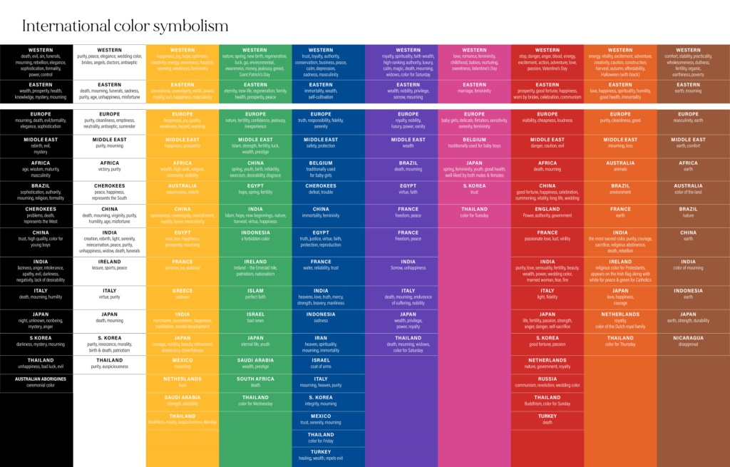
Do colours have different meanings for different cultures?
Our mind reacts to colours every day, even when we don’t really notice. When our eyes perceive a colour, the brain sends a signal to the endocrine system, which releases hormones that influence our mood. The success of a product depends a great deal on the colours used in its packaging.
But what about when the meaning is different from one culture to the next?
Around 98 languages in the world have words for the same eleven colours, but their meaning changes depending on the culture and the context, and also over time. While red was once the bridal colour in China, nowadays it is not unusual to see a Chinese bride wearing white. I worked with the Chinese market for many years, and in the end we always did everything in red. It’s the colour of good luck and happiness. So wine always has to be red, as do the creative concepts for Chinese New Year and all other important celebrations. For us, red is a warning colour: you can’t put up a red billboard by the road without risking causing an accident. In south India, it’s the colour of violence and destruction.
And while black is the colour of mourning, the food and beauty industries today use black for their luxury packaging. In the Middle East it is the colour of rebirth, mystery, and evil. For Aboriginal people, it is the colour of ceremonies.
For us in the West, blue might be the masculine colour par excellence, but in China it’s a feminine colour. In Thailand, pink is the colour of Tuesday. So if I’m communicating in that country I need to know this, since using pink could be the key to my storytelling. Which would lose all meaning as soon as I addressed it to a different culture.
Is wearing green forbidden in Indonesia? Yes, but not everywhere: only in the south part of the island of Java, on Parangtritis beach and Pelabuhan Ratu beach, where the local people believe that Nyai Roro Kidul, the Queen of the Southern Sea – always depicted dressed in green – could drag you into the sea and kill you if you wear something green.
But the same green is the sacred colour of Islam and is therefore a precious colour.
If I’m a fashion brand and I want to export to Indonesia, should I produce green shirts or avoid doing so?
If I know it’s a sacred colour and I’m communicating in an Islamic country, are there products where it would be better not to use it?
And now we come to the questions that we need to ask ourselves in order to define a method for visual design rooted in cultural intelligence.
oXXIgen
Imminent Research Report 2022
GET INSPIRED with articles, research reports and country insights – created by our multicultural interdisciplinary community of experts with the common desire to look to the future.
Get your copy nowCan social trends influence cultural understanding?
Our increasingly connected world is integrating differences and generating new languages. And while global trends influence the younger generations, who are more connected than ever, there are differences in how each culture makes these trends its own. For example, take young people in China: until recently, they were eager for luxury brands and iconic products. Now, on the other hand, they are disenchanted with capitalism and are returning to Chinese tradition, buying local products to bring new value to the phrase “Made in China”. Brands that want to enter China must strike up partnerships with Chinese brands to find success with the younger generations, who are embracing the ancient customs of their culture when it comes to entertainment, art and music.
While women in Saudi Arabia have always found eating out an uncomfortable experience, today restaurant tables are the scene of a new cultural revolution (Bloomberg 2021). Not only can women now eat at restaurants, they can also work as waitresses, bartenders or hostesses. Social trends become a fundamental piece of a brand’s visual localization.
When the world changes, it changes differently from culture to culture.
Is it possible to design a method that sums up this complexity?
As we were saying before, collaborative intelligence is once again the best path to validate our work here. More and more often, we find ourselves testing the communication of brands that want to open up to new languages and therefore to new cultures. The vast network of linguists that collaborate with us becomes a priceless resource in our work: a contemporary observatory rooted in local traditions and with an eye on the new common ground being constructed by technology and migration.
For brands interested in brand localisation, we build teams of copywriters and language leads for each country, and then we write the right questions here at Imminent. The right question is always the one that carries within it the best possible answer.
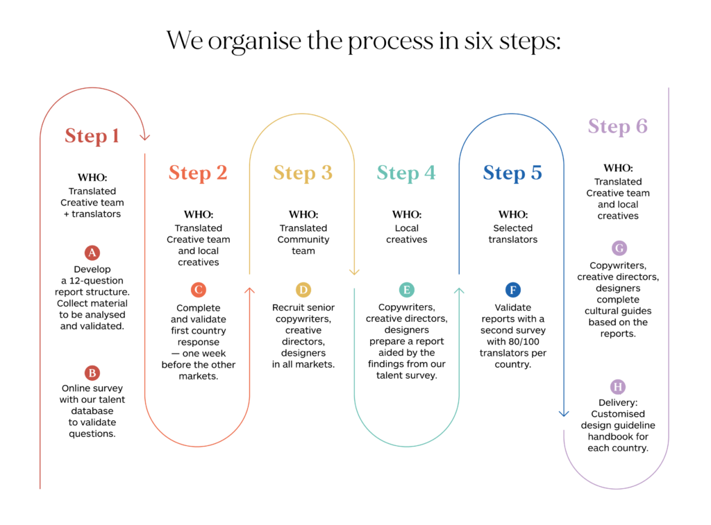
With regard to content, we have designed a validation method built on three fundamental areas of cultural intelligence that measure the impact of the creative concept on a specific culture, as well as exploring possible risk areas in relation to certain sensitive topics, words and images.
The three areas that we investigate are meaning, impact, and cultural sensitivity. We have attributed questions to each of these areas.
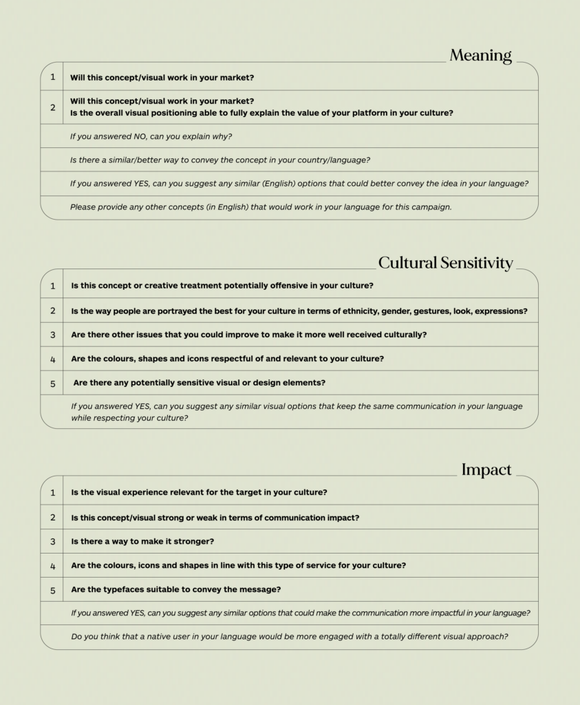
Once the linguists have answered these questions, we send the report to a panel made up of translators from different countries in order for them to assess the result. This step is fundamental to reduce the risk of overly personal responses based on the experience of one individual, and to encourage constructive dialogue regarding different perspectives. By vocation, translators specialise in verticals – economics, medicine, fashion, tourism – and they can supplement the results with their valuable points of view.
We have used this method for the first time this year – with very interesting results – to create brand localisation guidelines for our clients, who can thus involve marketing in the translation process and expand the potential for their message to be understood in different cultures.
This is undoubtedly the starting point (including creatively) to create new value from diversity and to explore new common ground between different cultures.
If we truly are people rather than personas, and thus not consumer stereotypes for marketing purposes but rather people whose richness lies in the diversity of their very being, perhaps the 21st century – a time of new worlds, new technologies and new migrations – will see us successfully use creative, collaborative intelligence to find new shared languages that allow all cultures to understand each other profoundly in a new way.
oXXIgen
Imminent Research Report 2022
GET INSPIRED with articles, research reports and country insights – created by our multicultural interdisciplinary community of experts with the common desire to look to the future.
Get your copy nowNicola Jones “Do You See What I See?”, Sapiens.org 2017
The Map Is Not the Territory, Farnam Street blog
Donna Abu-Nasr “Saudi Arabia’s Social Revolution Arrives at Riyadh Dining Tables”, Bloomberg, 2021
Photo credits: Ricardo Gomez Angel, Unsplash